CONTENT
While many websites out there are informative, there a lot of "ego
stroke" websites out there as well; they serve no other purpose than
to announce to the world that you are there. Without useful, somewhat
original content, a website is useless.
|
|
If you have a lot of material, but all of it can easily be observed elsewhere,
what's the point of people using your site? "Piggyback" sites
do little more than offer someone else's information in a different location.
As a web designer, it is important to be able to justify your creation.
If you can't, you should re-think what you're doing.
|
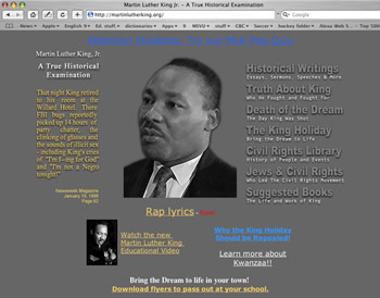
Another factor that must be addressed is bias. The influences, motivations and outlooks of the web designer are apparent in everything he or she does. Being able to measure these personal influences is increasingly important as web-editing programs allow people to create very professional- looking sites. As savvy surfers, we must avoid the trap of granting authority to those who don't deserve it.
|
|
Some practical advice:
- Content at the sake of all else, get it out there. Content is the most important aspect of a website. Browsers will tolerate poor design and aesthetic garishness if you have the information they need. You can lose hours tweaking minute details of a web page, so focus on getting things out on the web, then fine tune your work.
- Use the right tool for the job. Web editing programs are great for making websites, but are not effective text editing tools. Keep text in a word processor format so you can easily edit spelling and grammatical errors, then copy-and-paste to your webpage.
- Give credit where is credit is due. Record your sources for pictures and text information -- such content should be cited somewhere on your web site.
- Know your audience. What aesthetics (fonts, colours, textures, attitude) turns your audience on or off? What is your target audience capable of, or restricted from, reading? (E.g. are they on dial-up or high-speed internet connections? Can their processor handle Flash, movie, or other rich media?)


