AESTHETICS
Aesthetics deal with the visual appearance of a website. In order to engage
viewers, websites must have a pleasing appearance: the use of backgrounds,
colours, text, and images combine to invite people to your site. A site
that appears welcoming will be received well, while one that offends the
senses will be quickly refused.
The difficulty we face is that people don't always agree on what's visually pleasing and what's garish. For example, the following site gets mixed reviews in grade 9 English:
|
|

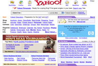
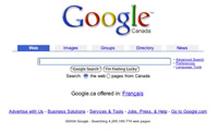
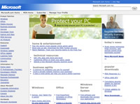
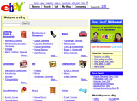
A simpler way to address this conundrum is to look for patterns in successful websites. Here are, in order, the five most popular webpages on the Internet, according to Alexa.com:
|
|

Furthermore, surfers place a lot of emphasis on appearance to gauge "professionalism".
By looking at the quality of the setup, surfers immediately start evaluating
the value of the site, rightly or wrongly.
Some practical advice:
- Break up information on your page. Reading endless amounts of text on a screen can be tedious and discourage surfers to continue using your site. Here is an example of a lengthy read on the topic of Ernest Shackleton's Antarctic expedition. By breaking up text, even if it's a simple bold title, you offer your information in easier to handle, bite-sized chunks.
- Avoid busy backgrounds. Busy backgrounds distract readers and create a situation where it is difficult to find a text colour that will show up successfully. Here is an example. (The page is a sample creation. Content courtesy of David Sheppard's "History of the Horton Crest" web page.)
- Set tables to zero. The use of tables is an effective way to anchor images and text, but like all frameworks, should be left behind the scenes. Visible tables should be reserved for items that need that level of visual organisation.
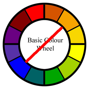
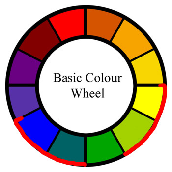
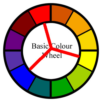
- Use a colour wheel. When choosing a colour scheme for your website, a general rule of thumb is to work across the colour wheel on two-tone web pages, and work on a principle of threes when using three-colour colour schemes:
|
|
- Build with consistency in mind. Typically, a site's first page looks different than all sub-pages, and all sub-pages are based on a common template. This pattern provides you with a simple, timesaving way to construct your site and provides a coherent standard for your audience.